Interactive UX in Microsoft 365 Copilot: MCP Apps and SPFx Components

An agent can explain a process. But sometimes I want to complete the process: check the values, correct a field, and submit a request without turning every edit into another chat message.
That is where an interactive UI helps. In Microsoft 365 Copilot, I can put a focused form, list, or review screen next to the conversation while keeping the actual business rules in the backend.
The terminology matters here. An MCP tool, a React component, and a Copilot-hosted UI are different things. Let’s look at how they fit together and where their security boundaries sit.
The Microsoft documentation and availability details in this article were checked on November 1, 2026. Verify current licensing, tenant policy, client support, and SDK compatibility before deploying.
The Model Context Protocol (MCP) lets a client discover and invoke server-side tools and access resources through a defined protocol. A declarative agent combines instructions and actions with Copilot’s orchestration. Neither a tool nor an agent definition is itself a user interface.
Conversation is not always the best form
Imagine an employee needs a new application access request. The request has a title, an access category, and a justification. A separate approval step happens after submission.
In a text-only experience, the agent can ask for each value, show a summary, and call a tool after confirmation. That works well for a small request or a user who prefers conversation.
As the number of fields and corrections grows, a form can make the current state easier to inspect. A user can edit two values, review the result, and explicitly submit it. A status list can then show the request identifier and its progress.
I don’t assume the form is always faster or more accessible. Both experiences should call the same business service and enforce the same permissions. The UI is an additional interaction surface, not a second source of truth.
Choose the integration, not just the UI library
There are several ways to put an interactive experience in a declarative agent. Two are especially relevant for developers:
| MCP App | SPFx Copilot UX component | |
|---|---|---|
| Integration | A remote MCP server exposes tools and UI resources to the agent. | An SPFx solution packages a declarative agent and client-side components. |
| UI hosting | The host reads an MCP UI resource and renders it in a sandboxed frame. | SharePoint hosts the packaged assets; the Copilot host renders the component. |
| Developer model | MCP tools, UI resource metadata, and the MCP Apps bridge. | BaseCopilotComponent, component manifests, and the SPFx toolchain. |
| Good fit | An existing service or MCP server that needs a portable UI contract. | A Microsoft 365 solution that already uses SPFx and the SharePoint App Catalog. |
- MCP App
- A remote MCP server exposes tools and UI resources to the agent.
- SPFx Copilot UX component
- An SPFx solution packages a declarative agent and client-side components.
- MCP App
- The host reads an MCP UI resource and renders it in a sandboxed frame.
- SPFx Copilot UX component
- SharePoint hosts the packaged assets; the Copilot host renders the component.
- MCP App
- MCP tools, UI resource metadata, and the MCP Apps bridge.
- SPFx Copilot UX component
BaseCopilotComponent, component manifests, and the SPFx toolchain.
- MCP App
- An existing service or MCP server that needs a portable UI contract.
- SPFx Copilot UX component
- A Microsoft 365 solution that already uses SPFx and the SharePoint App Catalog.
Microsoft 365 Copilot supports MCP Apps in declarative agents. It also supports Copilot UX components with SharePoint Framework 1.24.
Neither option makes a React component automatically runnable in every Copilot surface. The host must support the integration, and each component needs the correct packaging, authentication, and runtime APIs.
How an MCP App connects the pieces
An MCP App combines an MCP tool with a UI resource. The server exposes the tool; its metadata identifies the UI resource; the host decides whether it can render it.
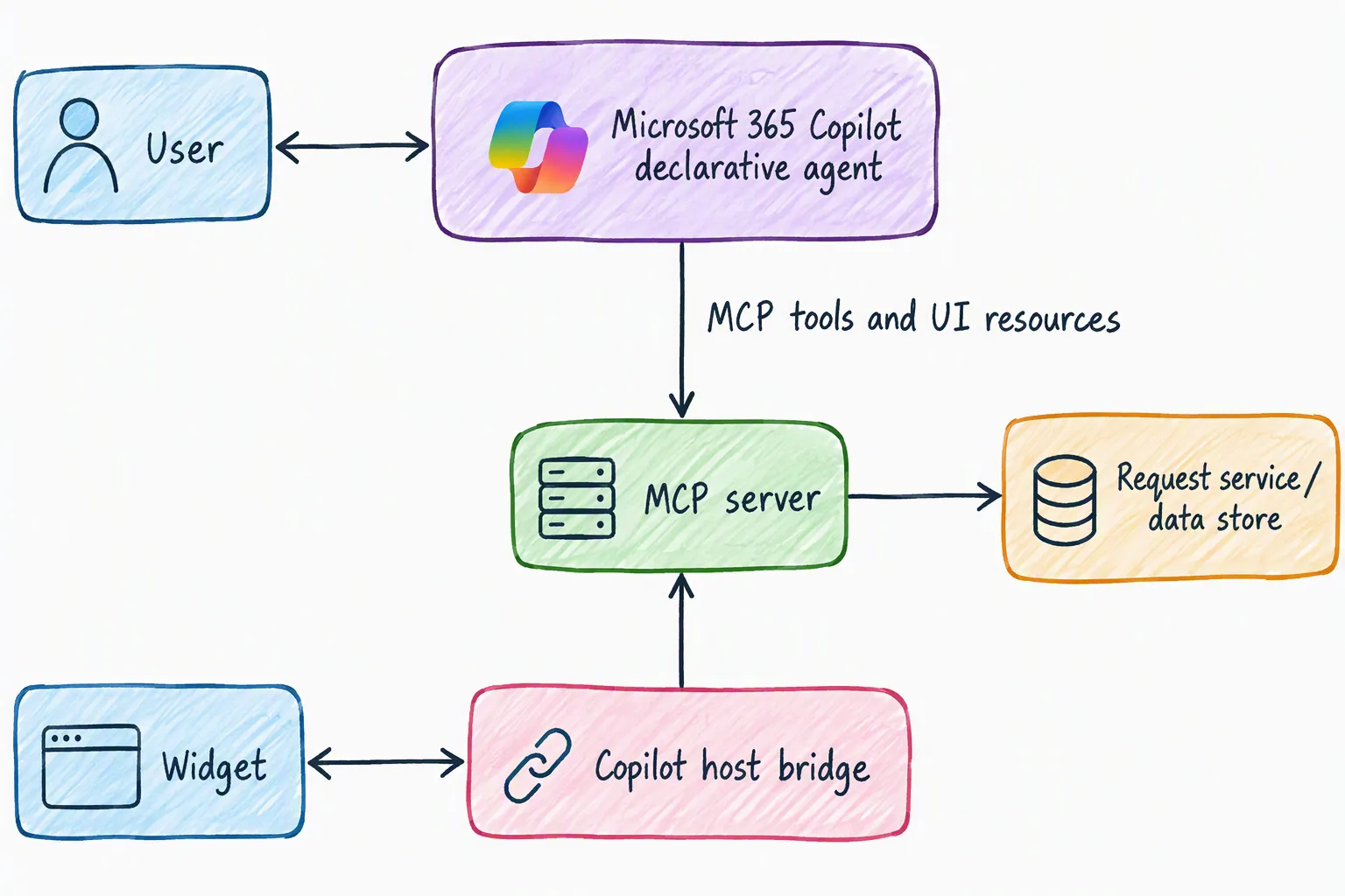
The widget communicates through the host bridge. It should not assume that it can read Copilot’s DOM or call an arbitrary backend with the user’s credentials.
A typical request flow looks like this:
- The host discovers tools through
tools/list. A tool descriptor contains an input schema and a reference to aui://resource. - The agent invokes the form tool. A compatible host reads the UI resource and renders its HTML in a sandboxed frame.
- The host passes tool input and results to the widget. With the MCP Apps SDK, the widget can receive them through
app.ontoolinputandapp.ontoolresult. - The user reviews the form. A deliberate submit action can call another tool through
app.callServerTool. - The backend validates the request, checks authorization, and returns a result. The UI displays the outcome rather than assuming the write succeeded.
MCP Apps use a host-mediated bridge based on postMessage. The UI resource has the MIME type text/html;profile=mcp-app; its ui:// identifier is an MCP resource URI, not a public HTTPS page. The MCP Apps overview explains the lifecycle and resource contract.
Register a tool and its UI resource
Here is a focused server-side example using @modelcontextprotocol/server 2.4.0, @modelcontextprotocol/ext-apps 2.0.4, and Zod 4.6.7 on Node.js 20 or later. It registers a read-only tool that opens a draft form. It does not submit a request.
import { readFile } from "node:fs/promises";
import { McpServer } from "@modelcontextprotocol/server";
import {
  registerAppResource,
  registerAppTool,
  RESOURCE_MIME_TYPE,
} from "@modelcontextprotocol/ext-apps/server";
import { z } from "zod";

const server = new McpServer({ name: "request-ux", version: "1.0.0" });
const resourceUri = "ui://requests/form.html";

registerAppTool(
  server,
  "show_request_form",
  {
    title: "Show request form",
    description: "Open a draft request form without submitting it.",
    inputSchema: z.object({ title: z.string().max(120).optional() }),
    annotations: { readOnlyHint: true },
    _meta: { ui: { resourceUri } },
  },
  async ({ title }) => {
    const draft = { title: title ?? "", status: "draft" };
    return {
      content: [
        { type: "text", text: "No request has been submitted." },
        { type: "text", text: JSON.stringify(draft) },
      ],
      structuredContent: draft,
    };
  },
);

registerAppResource(
  server,
  "request-form",
  resourceUri,
  { mimeType: RESOURCE_MIME_TYPE },
  async () => ({
    contents: [{
      uri: resourceUri,
      mimeType: RESOURCE_MIME_TYPE,
      text: await readFile(new URL("./request-form.html", import.meta.url), "utf8"),
    }],
  }),
);
The two registrations share the same URI. The text result gives a non-visual client something useful; structuredContent gives the widget structured values. Neither is a secret store: return only information the caller is allowed to see.
This is an excerpt, not a complete server. It assumes a bundled request-form.html beside the server module and leaves out HTTP transport, authentication, and the actual create operation. For a complete React example, start with Microsoft’s MCP interactive UI samples and check the package versions used by the sample you choose.
Receive the draft in React
The widget needs to connect to the host and handle the result. The SDK’s useApp hook creates the bridge, registers the handler before connecting, and reports connection errors. This small React component validates the received draft before putting it into a controlled input:
import { useState } from "react";
import { useApp } from "@modelcontextprotocol/ext-apps/react";
import { z } from "zod";

const draftSchema = z.object({
  title: z.string().max(120),
  status: z.literal("draft"),
});

export function RequestDraft() {
  const [title, setTitle] = useState("");
  const [status, setStatus] = useState("Waiting for the draft.");
  const { isConnected, error } = useApp({
    appInfo: { name: "Request form", version: "1.0.0" },
    capabilities: {},
    onAppCreated: (app) => {
      app.ontoolresult = (result) => {
        if (result.isError) {
          setStatus("The server could not open the draft.");
          return;
        }

        const draft = draftSchema.safeParse(result.structuredContent);
        if (!draft.success) {
          setStatus("The server returned an invalid draft.");
          return;
        }

        setTitle(draft.data.title);
        setStatus("Draft only. Nothing has been submitted.");
      };
    },
  });

  if (error) return <p role="alert">Could not connect to the host.</p>;

  return (
    <section>
      <label htmlFor="request-title">Title</label>
      <input
        id="request-title"
        value={title}
        maxLength={120}
        disabled={!isConnected}
        onChange={(event) => setTitle(event.target.value)}
      />
      <p role="status">{status}</p>
    </section>
  );
}
This fragment only reads and edits the draft; it doesn’t submit anything. Bundle the component and its dependencies into the HTML resource, and test the bridge in the target host.
Call a write tool from the widget
A form submission is a separate operation. For example, a widget can call a create_request tool after the user reviews and confirms the values:
import type { App } from "@modelcontextprotocol/ext-apps";

export async function submitRequest(
  app: App,
  title: string,
  idempotencyKey: string,
): Promise<string> {
  const result = await app.callServerTool({
    name: "create_request",
    arguments: { title, idempotencyKey },
  });

  if (result.isError) {
    throw new Error("The request could not be submitted.");
  }

  const data = result.structuredContent;
  if (
    !data ||
    typeof data !== "object" ||
    !("requestId" in data) ||
    typeof data.requestId !== "string" ||
    data.requestId.trim().length === 0
  ) {
    throw new Error("The server returned an invalid request result.");
  }

  return data.requestId;
}
This helper assumes the server separately implements and registers create_request; the previous snippet does not. The form must catch both tool errors and rejected bridge calls, show an actionable message, and display success only after receiving a valid result.
Generate one idempotency key for a confirmed logical submission and retain it for retries. The backend should scope the key to the caller, tenant, and operation, store it durably with the outcome, and reject reuse with different input. A disabled button alone does not prevent duplicate writes.
The SPFx alternative
SPFx Copilot UX components use a different integration model. A component extends BaseCopilotComponent, declares tools and supported display modes in its manifest, and receives tool properties through this.properties. The solution also contains the declarative agent definition.
For example, the component manifest can declare both display modes:
{
  "capabilities": {
    "availableDisplayModes": ["inline", "fullscreen"],
    "defaultDisplayMode": "inline"
  }
}
This is a manifest excerpt, not a complete component definition. The host controls the actual mode. The component reads this.hostContext.displayMode and can request fullscreen with this.requestDisplayModeAsync("fullscreen"); it must still handle the host declining the request. See Microsoft’s display-mode guidance.
For deployment, build an .sppkg, upload and enable it in the tenant’s SharePoint App Catalog, and use Add to Teams to sync the baseline declarative agent to the tenant agent catalog. With includeClientSideAssets enabled, the package includes the client assets for SharePoint to host.
At the time of writing, SPFx Copilot UX components require the Microsoft 365 Copilot add-on license, including for the Copilot Workbench. Microsoft documents browser and desktop support for Microsoft 365 Copilot and Teams, but not iOS or Android support at GA. Check the availability and GA limitations, including the manual Teams packaging workaround for combined solutions.
Give the agent useful context
Rendering a component does not mean the model can see its DOM. For SPFx, createCopilotTextContent creates a concise text description of the visible state. Use updateModelContextAsync for context on the next user message, or sendFollowUpMessageAsync for an intentional user-triggered follow-up.
Send only relevant, authorized information: for example, the selected request, visible status, and whether it is still a draft. At GA, Microsoft documents a 10 KB limit for text context and says an oversized message is blocked, not silently truncated. Handle that error and let the user reduce the selection. See Provide Copilot with context from your component.
Security belongs behind the button
A tool schema describes expected input. A readOnlyHint describes intended behavior. Neither grants permission or proves a caller is authorized.
For an MCP-based declarative agent, configure a supported authentication scheme, such as Microsoft Entra SSO or OAuth, and validate tokens at the server boundary. For Entra JWT access tokens, use appropriate middleware to check the signature, issuer, audience, lifetime, allowed tenant, and required scopes or roles.
Then authorize each business operation and the specific record. A user who can open an approval form is not necessarily allowed to approve the request. Never trust a user ID, tenant ID, or approval decision simply because the widget or model supplied it.
If the backend needs to call Microsoft Graph as the user, use a supported delegated flow such as OAuth on-behalf-of, with an access token intended for the backend and the required downstream permissions. Don’t forward a token meant for your API directly to Graph. A service identity is a different principal and does not automatically preserve the user’s permissions.
For browser-facing resources, restrict origins and content security policy to what the widget needs. Copilot documents an MCP-server-specific widget origin and provides a widget host URL generator. CORS is not authentication; protect the MCP endpoint and validate applicable Origin headers too. Keep tokens out of UI assets and tool output, minimize data shared with the model, and avoid logging sensitive request payloads.
Design for the actual host
I keep inline UI focused: a compact summary, a small form, or a clear confirmation. A complex workflow may need an expanded experience or a handoff to the full application. Microsoft recommends preserving the conversation and exposing focused capabilities rather than copying an entire application into chat.
The widget should provide keyboard access, visible focus, labels, validation messages, loading and error states, and a confirmation for consequential actions. A screen-reader user needs the same information and outcome as someone using a mouse.
Host support also varies. Microsoft’s MCP Apps capability table lists app.callServerTool and app.ontoolresult as supported, but not every bridge feature is available. For example, the table lists file-upload APIs and app.ontoolcancelled as unsupported. Check the current table before making a feature depend on them.
Provide a useful text result or another supported route when the host cannot render the UI. Don’t call a hidden button a fallback.
Test protocol, host, and business behavior
For an MCP App, I start by testing the server independently with an MCP client or Inspector:
- Confirm tool discovery, input schemas, the UI resource URI, and the returned HTML MIME type.
- Test valid and invalid inputs, structured results, explicit errors, and a repeated write with the same idempotency key.
- Verify that unauthorized users and expired or wrong-audience tokens cannot perform the operation.
Then I test the real Microsoft 365 Copilot host:
- Use Microsoft 365 Agents Toolkit to create a declarative agent with an MCP server action. Confirm the tenant allows custom app upload and Copilot access.
- Configure the remote server URL and a supported authentication scheme, provision the agent, and open it in Microsoft 365 Copilot.
- Invoke the form tool, verify that the widget renders, edit a value, and submit. Confirm the backend record and visible result agree.
- Test keyboard navigation, errors, expired access, and a client or configuration without UI support. Don’t treat an Inspector success as proof that Copilot can render the widget.
For SPFx, use the Copilot Workbench to test the component locally, then test the packaged agent in the target tenant. Workbench rendering does not verify agent discovery or intent matching.
To compare text and UI fairly, use the same test data, permissions, business rules, and success criteria. Record completion, corrections, user turns, failures, and accessibility observations for both paths. I would measure the result rather than claim a speed improvement without a real study.
Takeaway
Conversation is excellent for expressing intent and explaining a result. A focused UI is useful when people need to inspect state, correct structured values, or make an explicit decision.
The technical boundary stays the same: the host renders, the tool exposes a capability, and the business service validates and authorizes the operation. Choose MCP Apps or SPFx based on the host and deployment model, then test the complete path with real users and permissions.