From SPFx Webpart to SharePoint Copilot App with SPFx 1.24 Beta 2
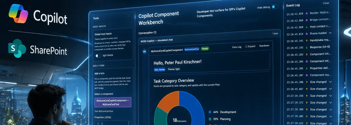
SPFx 1.24 Beta 2 is one of those releases where you immediately want to stop everything else and start building.
The headline feature for me is clearly SharePoint Copilot Apps. Not because it adds another place to render UI, but because it changes where business applications can show up. Instead of sending users to SharePoint first, we can now bring the experience directly into Microsoft 365 Copilot.
One of the first things I wanted to try was not a toy sample. I wanted a real use case.
One important detail up front: I built and tested this with the original code on my dev tenant. Because I am planning to share this snippet later, I removed the live HTTP interactions from the version shown here and replaced them with demo data. That keeps the blog post and the future sample focused on the new SharePoint Copilot App parts instead of backend plumbing.
The Use Case Behind My First SharePoint Copilot App
I already had an SPFx Webpart that shows users an overview of their current tasks.
The original solution was simple from a user perspective, but quite typical for real projects:
- An SPFx Webpart as the frontend
- An Azure Function as the API layer
- An external business system as the source of truth
- A pie chart to visualize the task distribution for the current user
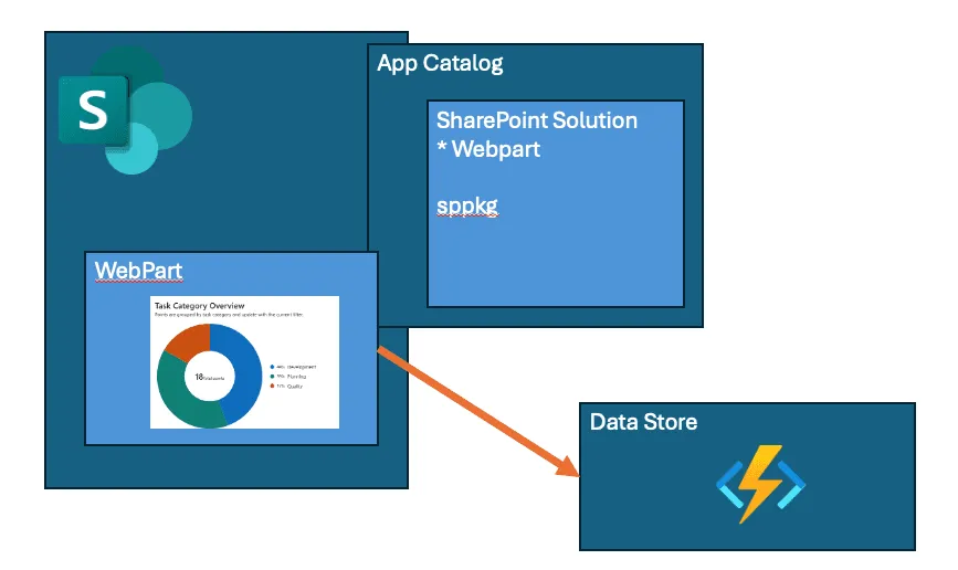
Based on the logged-in user, the solution determines which departments or responsibility areas belong to that person and then shows the current workload split.
That worked well inside SharePoint. But the more interesting question was this: why should users have to open SharePoint just to ask for something that Copilot could bring to them directly?
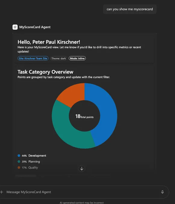
That is the part that makes SharePoint Copilot Apps interesting. The response is no longer just text. It can become a proper application surface.
Why This Is More Than a Demo
If a user asks for their current tasks, approvals, KPIs, or project status, a text-only answer is often not enough.
What we usually need is:
- A visual summary
- Context for the current user
- Actions or follow-up interaction
- The ability to expand into a richer experience
That is exactly where SharePoint Copilot Apps start to become powerful. You can bring dashboards, forms, approval views, scorecards, and other business UIs directly into the Copilot canvas.
For me, that is the real shift: Copilot stops being just a chat surface and starts becoming an application host.
My Demo Setup
For this first migration, I wanted the shareable version to stay focused on the new parts, especially the Copilot component model, the UI integration, and the host interaction, without adding backend complexity to the first walkthrough.
So the demo keeps the business idea intact, but strips the data access down to something that is easy to understand and easy to present.
That also means the code examples below stay focused on the Copilot component structure, property flow, display modes, and React integration instead of spending half the article on API plumbing.
In a real implementation, I would absolutely keep the existing backend pattern and just swap the frontend experience from Webpart to SharePoint Copilot App.
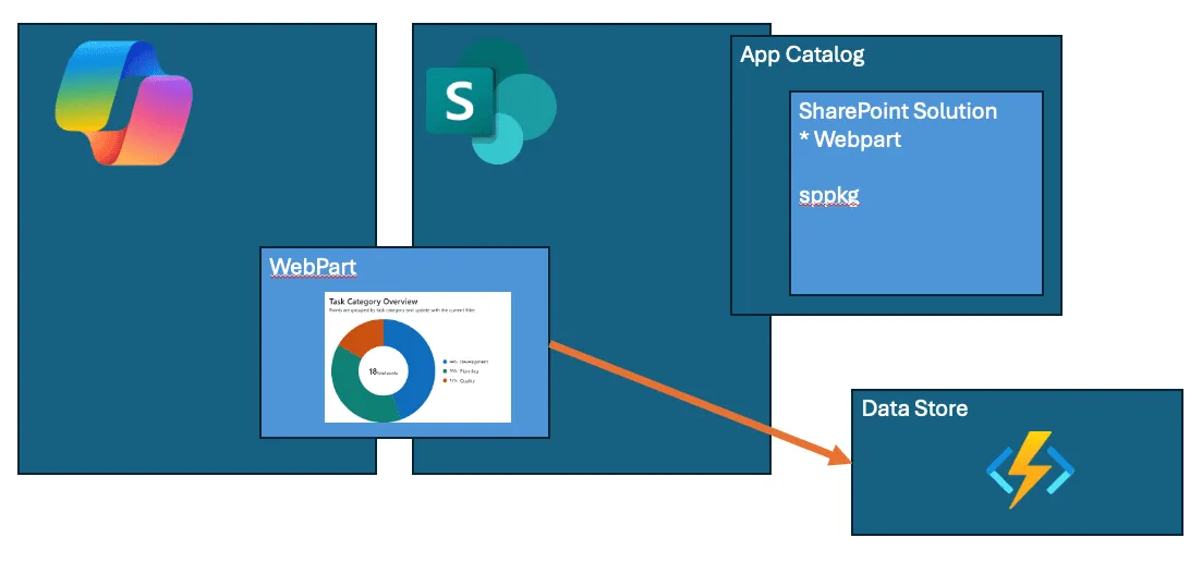
From Webpart to SharePoint Copilot App
What surprised me most was how much of the existing thinking still applied.
I did not need to relearn frontend development from scratch. The important building blocks were familiar:
- TypeScript
- React
- SPFx patterns
- Existing UI composition skills
- Existing business logic and backend concepts
That is why this feels so promising. If you already build SPFx solutions today, the jump into SharePoint Copilot Apps is not a hard reset. It is an evolution.
The user experience, however, is very different.
Instead of navigating to a page and loading a Webpart , the user can ask Copilot for their task overview and get an interactive response directly in the conversation flow.
The Original Webpart Debug Flow
Before moving into Copilot, I still like having the original SPFx Webpart available in isolation while working on UI behavior.
This was my debug URL:
https://tenant.sharepoint.com/sites/demo/SitePages/CollabHome.aspx?debugManifestsFile=https%3A%2F%2Flocalhost%3A4321%2Ftemp%2Fbuild%2Fmanifests.js&debug=true&noredir=true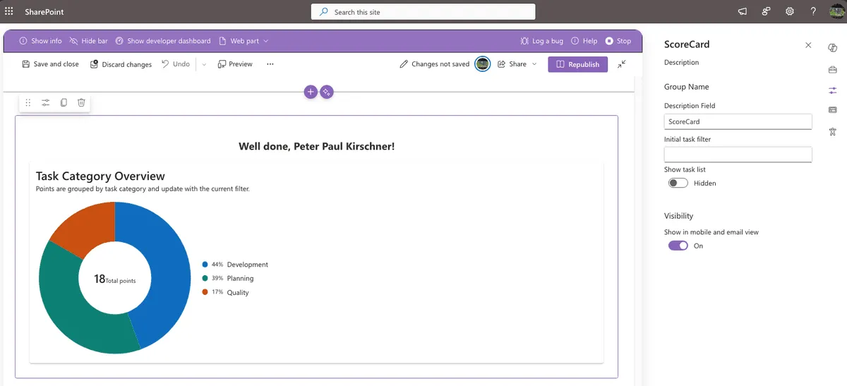
That is still useful during migration because it lets me compare the classic Webpart experience with the Copilot component behavior side by side.
For the Copilot side, this was my development Workbench URL:
https://tenatn.sharepoint.com/sites/dev/_layouts/15/copilotworkbench.aspx?debugManifestsFile=https%3A%2F%2Flocalhost%3A4321%2Ftemp%2Fbuild%2Fmanifests.js&debug=true&noredir=true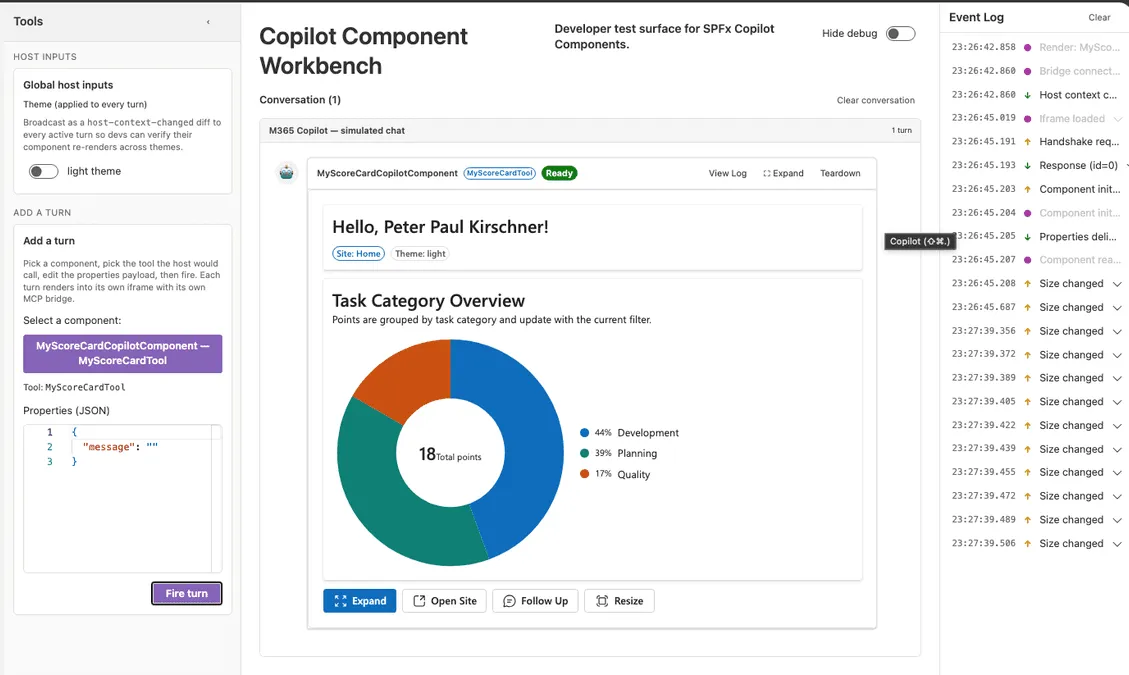
That gave me the second half of the story: the classic SPFx Webpart for isolated UI debugging, and the Copilot Workbench for validating the interactive Copilot experience.
Architecture at a Glance
The Copilot version is split into two layers:
- Host integration layer in the SPFx Copilot component class
- UI layer in the React component
That separation turned out to be very clean.
The SPFx layer deals with host context, initialization, bridge APIs, and property mapping.
The React layer focuses on rendering, state, interaction, and presentation.
End-to-End Flow: From Tool Invocation to UI
The runtime flow looks like this:
- Copilot invokes the tool defined in the component manifest.
- Tool arguments are validated using the JSON schema generated from Zod.
- The Copilot component initializes host-related data in
onInit. - The component maps runtime data and host APIs into a strongly typed React props object.
- React renders the UI and binds action handlers.
- User interactions call bridge methods to communicate back with the Copilot host.
In short: schema and manifest define what can be invoked, SPFx wires the platform context, and React renders the experience.
How the Properties Flow Through the Stack
This is the part many developers will want to understand first.
The property flow starts with the tool schema and ends inside the React component.
1. Tool argument schema
The component defines the arguments that Copilot is allowed to send.
In my sample, that is a required message and an optional taskFilter.
const propertiesSchema = z.object({
  message: z.string().describe('A message to display.'),
  taskFilter: z.string().optional().describe('Optional filter for task category.')
});

export type IMyScoreCardCopilotComponentProperties = z.infer<typeof propertiesSchema>;
export default zodToJsonSchema(propertiesSchema);
This is important because it creates a clear contract for what the tool can receive.
2. Manifest wiring
The manifest then points to the compiled schema.
{
  "capabilities": {
    "availableDisplayModes": ["inline", "fullscreen"]
  },
  "tools": [
    {
      "name": "MyScoreCardTool",
      "propertiesSchema": {
        "id": "$../../../lib/copilotComponents/myScoreCard/MyScoreCardCopilotComponentProperties.js:default;"
      }
    }
  ]
}
This makes the tool arguments both discoverable and enforceable.
3. SPFx to React mapping
Inside the Copilot component class, render() creates a strongly typed props object for React.
That object contains:
- Tool arguments like
messageandtaskFilter - User and site context
- Host display information
- Bridge methods for host interaction
- Wrappers to request display-mode or size changes
- The target document for style injection
- Localized strings
protected render(): void {
  const props: IMyScoreCardProps = {
    message: this.properties.message,
    taskFilter: this.properties.taskFilter,
    userDisplayName: this._userDisplayName,
    siteTitle: this._siteTitle,
    siteUrl: this._siteUrl,
    hostContext: this.hostContext,
    bridge: this.context.copilotBridge,
    onRequestDisplayMode: async (mode: SPCopilotDisplayMode) => {
      await this.requestDisplayModeAsync(mode);
    },
    onRequestSizeChange: async (width: number, height: number) => {
      await this.requestSizeChangeAsync(width, height);
    },
    targetDocument: this.context.domElement.ownerDocument,
    strings
  };

  ReactDOM.render(React.createElement(MyScoreCard, props), this.context.domElement);
}
That mapping layer is the bridge between the Copilot host and the React UI.
4. React consumption
The React component then consumes those props and turns them into actual behavior.
That includes:
- Greeting and message display
- Site and host badges
- Filtered score card rendering
- Fullscreen actions
- Resize actions
- Follow-up interactions with the host
const {
  message, taskFilter, userDisplayName, siteTitle, siteUrl, hostContext,
  bridge, onRequestDisplayMode, onRequestSizeChange, strings
} = props;

const theme = hostContext.theme === 'dark' ? webDarkTheme : webLightTheme;
const isExpandedView = isExpanded || hostContext.displayMode === 'fullscreen';

<BaseScoreCard
  title="Task Category Overview"
  externalFilter={taskFilter}
  showTaskList={isExpandedView}
/>
That is where the UI finally becomes contextual.
What availableDisplayModes Really Means
One small manifest entry has a surprisingly big effect:
"availableDisplayModes": ["inline", "fullscreen"]This tells the host exactly which rendering modes are supported.
In practice that means:
inlineallows the component to render directly in the conversationfullscreenallows the component to expand into a larger surface- The host only allows transitions to modes declared in the manifest
So if the component requests fullscreen, that only works because fullscreen is explicitly allowed.
The React layer can also branch behavior based on the current host mode.
In my sample, the detailed task list becomes visible when either local expanded state is active or the host is already in fullscreen mode.
const isExpandedView = isExpanded || hostContext.displayMode === 'fullscreen';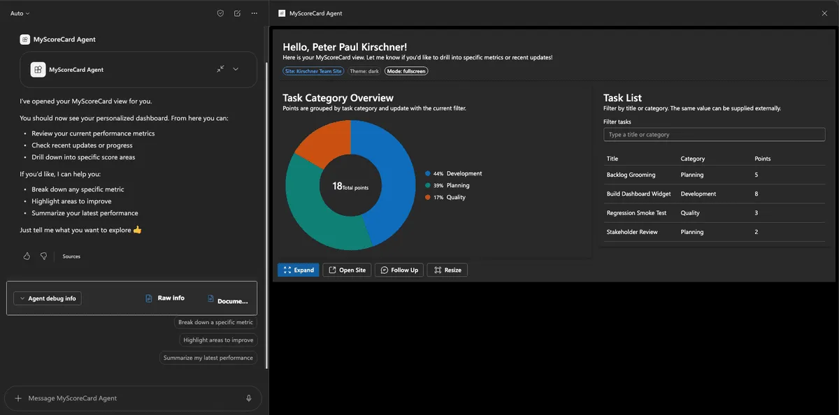
That pattern is simple, but it makes the component feel much more natural inside Copilot.
Understanding MyScoreCard(props: IMyScoreCardProps)
The function signature tells you a lot about the structure of the solution.
export default function MyScoreCard(props: IMyScoreCardProps): React.ReactElement {
  const {
    message, taskFilter, userDisplayName, siteTitle, siteUrl, hostContext,
    bridge, onRequestDisplayMode, onRequestSizeChange, strings
  } = props;
}
This means:
MyScoreCardis a typed React function componentpropsmust satisfy theIMyScoreCardPropsinterface- The UI contract is explicit and compile-time checked
export interface IMyScoreCardProps {
  message: string;
  taskFilter?: string;
  userDisplayName: string;
  siteTitle: string;
  siteUrl: string;
  hostContext: ICopilotComponentHostContext;
  bridge: ISPCopilotBridge;
  onRequestDisplayMode: (mode: SPCopilotDisplayMode) => Promise<void>;
  onRequestSizeChange: (width: number, height: number) => Promise<void>;
  targetDocument: Document | undefined;
  strings: IMyScoreCardStrings;
}
I like this pattern because it keeps the responsibilities clean:
- SPFx handles platform integration
- React handles rendering
- TypeScript makes the contract between both layers explicit
That is exactly the kind of structure you want if the component grows over time.
What Changed During the Migration
From a technical perspective, the biggest shift was not the UI. It was the hosting model.
The business idea stayed the same:
- Show task information for the current user
- Visualize it in a meaningful way
- Make it easy to drill into details
But the delivery model changed completely:
- Before: users navigated to SharePoint and opened a page
- Now: users ask Copilot and get the application directly in context
That is why I think this feature matters. It does not replace SharePoint development knowledge. It gives that knowledge a new surface.
Why This Pattern Works So Well
For me, the current sweet spot looks like this:
- Keep platform-specific concerns in the SPFx Copilot component class
- Keep rendering concerns in React
- Define tool inputs through Zod and JSON schema
- Use typed interfaces between layers
- Reuse existing UI and backend concepts wherever possible
That makes the solution easier to extend later with:
- More tool arguments
- More host actions
- Richer detail panels
- Real backend integration instead of demo data
Final Thoughts
This first migration made one thing very clear for me: SharePoint Copilot Apps in SPFx 1.24 Beta 2 are not just a nice demo feature.
They open a real path for bringing existing business applications into the flow of work without throwing away the frontend skills, APIs, and architectural patterns we already have.
For this demo, I removed the HTTP calls so I could focus on the component model itself. But the important takeaway is the opposite: in a real project, I would keep the real backend and simply move the user experience closer to where the user already is.
And that is the interesting part. The same business logic. The same application idea. A completely different entry point.
One final note: I am using the current term SharePoint Copilot App in this post because that is how the feature shows up for me right now. Since this is still Beta 2, it would not surprise me if Microsoft adjusts the naming before general availability.